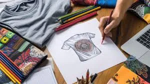
Discover 5 Effortless Design Hacks to Elevate Your Printwear
When it comes to printwear, creating eye-catching designs that resonate can make all the difference. If you’re looking to take your prints to the next level without breaking a sweat, here are five easy yet effective design hacks that can help you achieve that goal. These tips work across a range of branded apparel, from custom dri fit t shirts for athletic wear to custom printed sweatpants for stylish loungewear or giveaways.
1. Leverage Contrast to Make Your Designs Pop
Using contrasting colors and elements in your design can help important details stand out. Make sure to create a strong difference between your background and main design elements to enhance visual appeal.
2. Focus on Simplicity
Less is often more when it comes to design. Overcomplicating your printwear can create a cluttered and overwhelming impression. Stick to clean lines, simple shapes, and a limited color palette to maintain a sleek and appealing look.
3. Choose the Right Font
Typography plays a crucial role in your design’s success. Select fonts that are not only aesthetically pleasing but also easy to read. Avoid overly intricate fonts that can distract from the message of your design.
4. Incorporate Texture for Added Depth
Adding texture, like embroidery on custom embroidered sweatpants or raised prints on custom hoodies, can make your designs more dynamic and interesting. This could include physical textures like embroidery or digital textures added during the design process. Depending on the material and printing method, textures can add a significant wow factor to your printwear.
Frequently Asked Questions
What are some examples of contrasting color combinations?
Some popular contrasting color pairs include black and white, blue and yellow, and red and green. These combinations create a strong visual impact and help important elements stand out.
What are some examples of contrasting color combinations?
Some popular contrasting color pairs include black and white, blue and yellow, and red and green. These combinations create a strong visual impact and help important elements stand out.
What are some examples of contrasting color combinations?
Some popular contrasting color pairs include black and white, blue and yellow, and red and green. These combinations create a strong visual impact and help important elements stand out.
What are some examples of contrasting color combinations?
Some popular contrasting color pairs include black and white, blue and yellow, and red and green. These combinations create a strong visual impact and help important elements stand out.
Table of Contents
- Discover 5 Effortless Design Hacks to Elevate Your Printwear
- Leverage Contrast To Make Your Design Pop
- Choose the Right Font
- FAQs
Discover 5 Effortless Design Hacks to Elevate Your Printwear
When it comes to printwear, creating eye-catching designs that resonate can make all the difference. If you’re looking to take your prints to the next level without breaking a sweat, here are five easy yet effective design hacks that can help you achieve that goal. These tips work across a range of branded apparel, from custom dri fit t shirts for athletic wear to custom printed sweatpants for stylish loungewear or giveaways.
1. Leverage Contrast to Make Your Designs Pop
Using contrasting colors and elements in your design can help important details stand out. Make sure to create a strong difference between your background and main design elements to enhance visual appeal.
2. Focus on Simplicity
Less is often more when it comes to design. Overcomplicating your printwear can create a cluttered and overwhelming impression. Stick to clean lines, simple shapes, and a limited color palette to maintain a sleek and appealing look
3. Choose the Right Font
Typography plays a crucial role in your design’s success. Select fonts that are not only aesthetically pleasing but also easy to read. Avoid overly intricate fonts that can distract from the message of your design.
FAQs
Some popular contrasting color pairs include black and white, blue and yellow, and red and green. These combinations create a strong visual impact and help important elements stand out.
Use negative space to frame your main design elements, creating a balanced and uncluttered look. Practicing minimalism and focusing on essential elements also helps in utilizing negative space effectively.
You can incorporate physical textures like embroidery or patches or use digital textures, such as grunge effects or organic patterns, during the design phase. Choose textures based on the mood and message of your printwear.
Font selection is crucial as it conveys the tone and readability of your design. Choose fonts that complement your design theme while ensuring legibility on the chosen printwear material.
